前言
上一篇我们简单实验了一下一些预定义的transition-timing-function关键字,实际上这些关键字同样也适用于animation-timing-function.这一篇我们就趁热打铁,配合animation来制作一个可显示时间的摆钟。
需求分析
- 在我们实现代码前,首先得知道摆钟长啥样,其次再分析它的各个零部件是如何运动的。下面直接用图片展示吧。
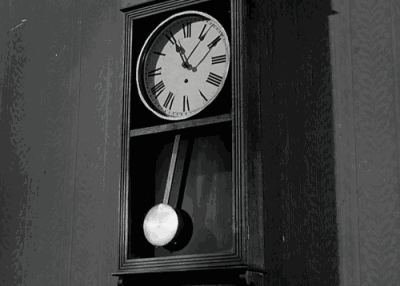
- 从运动规律上看,我们可以把它拆解成两部分,一部分是普通的时钟,指针按不同的频率做圆周运动;一部分是下面的单摆,做着平面单摆运动。因此,在我们实现的时候可以把它分成两部分实现,最后进行组合。
单摆的具体分析与代码实现
下面我们将对单摆进行具体分析与代码实现。
单摆的结构
静止的单摆无非就是一根线+一个球,球形盒子只需设置圆角属性
单摆的运动规律
单摆在最高点速度最0,在最低点速度最大,那么可以使用如下方式模拟它的运动轨迹
1
| animation-timing-function:ease-in-out
|
单摆是一个理论上无限次地周期性运动,那么则有
1
2
| animation-iteration-count:infinite;
animation-direction:alternate;
|
假设单摆最高摆到45度,分解它半个周期的关键帧有
1
2
3
4
5
6
7
8
| @keyframes swing{
from{
transform:rotate(45deg);
}
to{
transform:rotate(-45deg);
}
}
|
已知单摆的一个周期为1s,那么综合上述代码可以得到缩写
1
| animation:swing,.5s,ease-in-out,infinite,alternate
|
单摆绕着线的末端旋转,那么需要修改他的旋转点
1
| transform-origin:center top
|
代码实现
1
2
3
4
5
6
7
8
9
10
11
12
13
14
15
16
17
18
19
20
21
22
23
24
25
26
27
28
29
30
31
32
33
34
35
36
37
38
39
40
41
42
43
44
45
46
47
48
49
| <!DOCTYPE html>
<html>
<head>
<meta charset="utf-8">
<style>
div {
margin: 0 auto;
}
@keyframes swing {
from {
transform: rotate(45deg);
}
to {
transform: rotate(-45deg);
}
}
#simple-pendulum {
animation: swing .5s ease-in-out infinite alternate;
width: 30px;
transform-origin: center top;
}
#ball {
height: 30px;
width: 30px;
background: red;
border-radius: 100%;
}
#line {
height: 100px;
width: 10px;
background: yellow;
}
</style>
<title>simple-pendulum</title>
</head>
<body>
<div id="simple-pendulum">
<div id="line"></div>
<div id="ball"></div>
</div>
</body>
</html>
|
眼见为实
时钟的具体分析与代码实现
下面我们将对时钟进行具体分析与代码实现。
时钟的结构
- 时钟是一个圆形容器。
- 容器里面有时针、分针、秒针,长度为时针<分针<秒针。
- 时钟里还有刻度和数字,每间隔6°一个小刻度,每间隔30°一个大刻度。
关键点1:时钟与指针
指针在时钟中水平垂直居中并向上偏移指针高度的50%。
水平垂直居中是一个老生常谈的问题,下面直接给出一个相对比较好且兼容性强的解决方案,实现原理是依据绝对定位的格式化宽高计算公式
计算公式粗略可表示为容器大小=top/right/bottom/left+margin+border+padding+width/height
当然有机会的话之后再写一篇文章慢慢分析水平垂直居中。
1
2
3
4
5
6
7
8
9
10
11
12
13
14
15
| .father{
width:200px;
height:200px;
position:relative;
}
.son{
width:10px;
height:100px;
position:absolute;
top:0;
right:0;
bottom:0;
left:0;
margin:auto;
}
|
最后向上偏移指针高度的50%和指针旋转点
1
2
| transform:translateY(-50%);
transform-origin:center bottom;
|
关键点2:时钟刻度
虽然这里用js配合jquery实现起来比较简洁,但是作为学习研究,我们要使用一切可能的方法去实现需求。
首先时钟是个圆形,我们要先把所有刻度移动到圆的顶部并居中,之后分别绕时钟中心点旋转不同的角度,当然复制粘贴的过程会有点繁琐。
对于数字,因为数字不能跟着像刻度一样旋转(旋转了以后数字朝向就变了),所以我们直接用绝对定位,并通过极坐标转直角坐标系的公式,算出偏移值。
下面将给出一个标有刻度为1的时钟的实现代码。
具体数值的计算公式已给出,此处细节处理比较多,能实现较完美的对齐效果。
1
2
3
4
5
6
7
8
9
10
11
12
13
14
15
16
17
18
19
20
21
22
23
24
25
26
27
28
29
30
31
32
33
34
35
36
37
38
39
40
41
42
43
44
45
46
47
48
49
50
51
52
53
54
55
56
57
58
59
60
61
62
63
64
65
66
67
68
69
70
71
| <!DOCTYPE html>
<html>
<head>
<meta charset="utf-8">
<style>
#clock {
width: 300px;
height: 300px;
border-radius: 50%;
border: 1px solid;
font-size: 20px;
position: relative;
}
.scale>div {
position: absolute;
height: 5px;
width: 2px;
left: 50%;
background-color: black;
transform-origin: 0 150px;
}
.scale>div:nth-child(5n+1) {
height: 10px;
}
.number>div {
position: absolute;
line-height: 20px;
width: 20px;
text-align: center;
}
.number1 {
left: 205px;
top: 27.41px;
}
.number12 {
left: 140px;
top: 10px;
}
</style>
<title>clock</title>
</head>
<body>
<div id="clock">
<div class="scale">
<div class='scale0' style="transform: rotate(0deg);"></div>
<div class='scale1' style="transform: rotate(6deg);"></div>
<div class='scale2' style="transform: rotate(12deg);"></div>
<div class='scale3' style="transform: rotate(18deg);"></div>
<div class='scale4' style="transform: rotate(24deg);"></div>
<div class='scale5' style="transform: rotate(30deg);"></div>
</div>
<div class="number">
<div class="number1">1</div>
<div class="number12">12</div>
</div>
</div>
</body>
</html>
|
眼见为实
时钟的运动规律
时钟有三个指针,每个指针的运动频率不同。其中,时针和分针是匀速地连续地周期运动,秒针是匀速地一秒一帧地周期运动。
分针的动画粗略可以表示为
1
2
3
4
5
6
7
8
9
| @keyframes rotation{
from{
transform:rotate(0deg);
}
to{
transform:rotate(360deg);
}
}
animation:rotation 3600s liner infinite
|
秒针的动画粗略可以表示为
1
2
3
4
5
6
7
8
9
| @keyframes rotation{
from{
transform:rotate(0deg);
}
to{
transform:rotate(360deg);
}
}
animation:rotation 60s steps(60,end) infinite
|
眼见为实
因为代码比较长,冗余的地方比较多,感兴趣的请自行F12
最终实现效果
直接上图不解释(待美化),感兴趣的请自行F12
后记
作为刚学习动画的菜鸟,css3动画有太多有趣的地方以及实现的细节与技巧。比起js动画,css3动画在实现比较简单的动画时有着较大优势,且不容易出现丢帧的情况,值得深入学习与研究。